
Why I trade stocks and stock ETFs, and only from the long side
Six independent studies found that winning stocks keep winning. I measured it on my own data — and the drift underneath it matters far more.
There is one reason, and it is not that stocks are exciting. It is that buying stocks and holding them is the only place I have found where the base rate is on your side.
The base rate is what you get for doing nothing clever: the average outcome, across everybody, before anyone's skill or stupidity is added to it. In most markets that number is zero or worse — one person's gain is another's loss, and the costs come out of both. In the stock market, over every long record anyone has kept, the person who simply bought and held made money.
That is what decides where I work. Everywhere else, my system has to earn the whole return by itself. Here, a century of history has already earned part of it, and my job is mostly not to lose the rest.
That is a smaller claim than the one people usually make, so let me be exact about it. I am not saying stocks always go up. I am not saying they will go up from here. I am saying three things. Over the longest records anyone has assembled, a diversified basket of stocks held for a long time was the thing that paid. The effect has been measured independently — by different people, on different continents, in different centuries. And no comparable tailwind has been found on the short side, in currencies, in commodities, or in day trading. So if I am going to spend my life running systems, I would rather run them somewhere the wind has been behind me for as long as anyone has kept records.
Below is the evidence, my own measurement of it, and the parts of it that argue against me. That last section is the one worth reading twice.
Momentum: six studies, three centuries, the same answer
Start with the narrow version of the claim: stocks that have gone up over the past year have tended to keep going up over the next few months, relative to the ones that went down. The effect is called momentum, and it is one of the most heavily replicated findings in finance.
The recipe is simple. Sort every stock in a market by its return over the past year. Take the top ten percent — call them the winners — and the bottom ten percent, the losers. Wait three to twelve months, and measure what each group did.
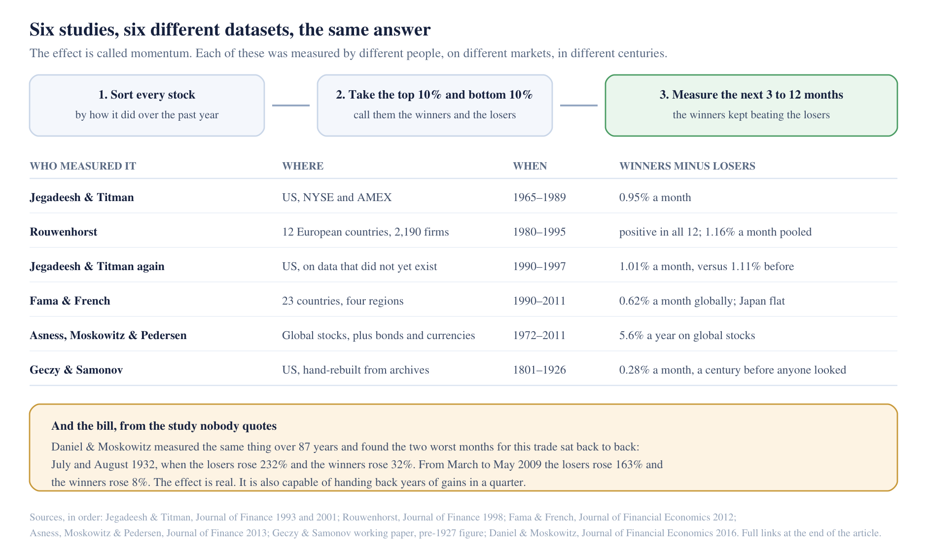
Jegadeesh and Titman did it first, in the Journal of Finance in 1993. On US stocks listed on the NYSE and AMEX between 1965 and 1989, ranking on the past six months and holding for six, the winners returned 1.74% a month and the losers 0.79% — a gap of 0.95% a month, with a t-statistic of 3.07. (A t-statistic measures how big a result is compared with the noise around it. Above about two, convention stops calling it chance. It is a convention, not a probability that the effect is real.) In their own words, the strategy "realizes a compounded excess return of 12.01% per year on average." Excess means on top of what simply parking the cash would have paid. That figure is before all trading costs, and it is for a book that has to short the losers as well as buy the winners.
Rouwenhorst repeated it on a different continent, in the same journal in 1998, using 2,190 firms across twelve European countries from 1980 to 1995: Austria, Belgium, Denmark, France, Germany, Italy, the Netherlands, Norway, Spain, Sweden, Switzerland and the UK. The winners came out ahead in all twelve countries. Pooled into one internationally diversified portfolio, the gap was 1.16% a month. It was not uniform: Spain's gap was 1.32% a month, Sweden's was 0.16%, small enough that it could easily have been chance. So: ahead in twelve countries out of twelve, but a gap actually worth having in four of them.
Jegadeesh and Titman went back and checked their own homework in 2001, on data that did not exist when they did the original work. Re-measuring the 1965–1989 window on their updated sample gave 1.11% a month; the fresh window, 1990 to 1997, gave 1.01% a month. Barely moved. This is the cleanest answer available to the obvious accusation — that they went hunting through a thousand rules and published the one that happened to work. You cannot tune a rule to a decade that has not happened yet. Testing an idea on data that arrived only after the idea was published is called going out of sample, and it is the test that counts. The phrase comes back twice below.
Fama and French, the two economists whose models most of the industry uses, tested it across 23 countries and four regions from November 1990 to March 2011. Their conclusion, verbatim: "Except for Japan, there is return momentum everywhere." Globally the gap was 0.62% a month; in Europe 0.92%; in Japan 0.08%, which is to say nothing at all.
Two more, stretching the evidence wider and further back. Asness, Moskowitz and Pedersen widened it in 2013 into global stocks, bonds, currencies and commodities from the early 1970s to 2011; on global stocks the top third beat the bottom third by 5.6% a year. And Geczy and Samonov went the other way, backwards, rebuilding US stock returns from paper archives covering 1801 to 1926 — a century that ends before the modern databases begin, in a period when nobody had heard of the effect and nobody could have been trading it. There the top third beat the bottom third by 0.28% a month. Smaller. But there.
That is six studies from five separate teams. Two of them share authors, but the second Jegadeesh and Titman paper's data postdates the first paper's sample entirely, which is the one form of independence that answers a data-mining charge. More importantly the data barely overlap: Rouwenhorst's European database has nothing to do with the American one, Fama and French assembled their international set from different commercial sources again, and the nineteenth-century series was hand-built from archives that did not exist in machine-readable form until recently. Six studies, five teams, at least four separate datasets, three centuries, both sides of the Atlantic.
That is a genuinely strong result. It is also not a promise, and the next section is where I stop being comfortable.
I measured it myself, and it was not the number I wanted
I have a backtest engine and a database that records who was in the S&P 500 on any given day, so rather than take the papers on trust I measured the thing directly. This is not a strategy and there are no trading costs in it. It is the raw effect, measured the way the papers measure it.
At each month end from January 1991 to May 2026, I took the companies that were in the S&P 500 on that day — including the ones that later went bankrupt. That last part matters more than it sounds. 638 of the 1,301 listings in my sample have price histories that simply stop, because the company was taken over, merged away or went under. Leave those out and you only measure the survivors, which is how you accidentally prove that stocks always win.
I ranked the survivors and the doomed alike by how much they had gone up over the previous eleven months, deliberately ignoring the most recent month. Prices tend to snap back over a few weeks, and that short-term bounce muddies the year-long trend. Every paper above skips it for the same reason. Then I split the ranking into ten equal groups of about fifty companies and measured what each group did over the next three months. That is 425 monthly measurements across an average of 497 companies each.
Here is what came back. Each figure is the average return of that group over the following three months, across all 425 measurements:
| group | average return over the next 3 months |
|---|---|
| top tenth (the winners) | +3.73% |
| all index members | +3.15% |
| bottom tenth (the losers) | +2.72% |
The ordering is right. The winners beat the losers by about one percentage point a quarter, and did so in 249 of the 425 measurements — which means they lost 176 times. Roughly six quarters in ten, not nine.
But look at the middle row, because it is the actual story of this article: the average member of the index made +3.15%, and even the worst-ranked tenth made +2.72%. The ranking added a little. The drift did the heavy lifting.
And the little it added has not been stable. The same 425 measurements, cut into four eras — each figure is how far ahead of the losers the winners finished over the following three months, so a minus sign means the losers won:
| period | winners finished ahead of the losers by |
|---|---|
| 1991–1999 | +4.45 percentage points |
| 2000–2008 | +0.53 points |
| 2009–2017 | −1.81 points — the losers won |
| 2018–2026 | +0.86 points |
Measured against the average index member rather than against the losers, the winners added 1.24 points a quarter from 1991 to 2008, and −0.09 points, which is nothing, from 2009 to 2026. The worst twelve-month stretch was an average of −25.3 points a quarter, ending December 2009.
Two honest caveats before anyone draws the wrong conclusion.
First, I measured only the 500 largest US companies, because that is where I can actually trade. The academic work measures the whole market, and much of the effect there lives in small, thinly traded names I would not touch. My flat result is a statement about large caps, not a refutation of the papers.
Second, there are no trading costs in these numbers at all — no commission, no gap between the price you can buy at and the price you can sell at, no getting a worse fill than you hoped for. And momentum makes you trade constantly: every quarter the rankings shuffle and most of the portfolio turns over. Novy-Marx and Velikov measured the real cost of getting in and out of this kind of strategy at over half a percent for each buy-and-sell round, and found that the fast-trading strategies in their sample gave up most of their raw edge to those costs — several of them all of it. Half a percent a quarter, against a gap of about one percent a quarter, is most of the gap.
So I do not treat momentum as a money machine. I treat it as evidence that prices have trended rather than snapped back at this horizon, in every sample anyone has measured — a much more modest thing to believe, and one that has held in more places.
There is one figure that survives all of my complaints, and it is worth putting here rather than burying it. Daniel and Moskowitz measured this trade over 87 years, and found that the top tenth on its own, held long, with no short leg at all, earned 7.5% a year more than its exposure to the market would predict, with a t-statistic of 5.1. That is the version of momentum that a long-only trader can actually reach. It is before costs, and it comes with a bill I will come back to at the end.
The force underneath: the drift
The bigger reason I am here has nothing to do with ranking anything.
Over the 126 years from 1900 to 2025, Dimson, Marsh and Staunton's dataset — the most complete long-run record I know of, covering 35 markets — shows US shares returning 9.8% a year before adjusting for inflation, against 4.6% for bonds and 3.4% for Treasury bills, while inflation itself ran at 2.9%. One dollar became $124,854. After inflation that is 6.6% a year for shares against 1.6% for bonds and 0.5% for bills. And the breadth claim is the one that matters most: shares were the best-performing asset class in all 21 of their countries with continuous investment histories.
I ran the same question on my own data, on the index itself.
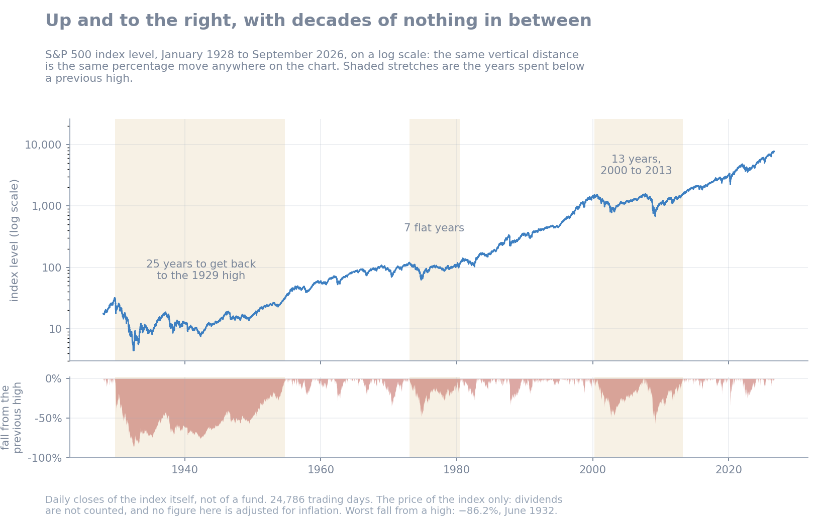
The S&P 500 went from 17.76 at the start of January 1928 to 7,718.60 on 4 September 2026 — 24,786 trading days. A dollar in the index became $434, which works out to 6.35% a year. That figure is the price of the index only: it excludes dividends, and it is not adjusted for inflation. Sixty-six of the 98 completed calendar years were up.
An average hides more than it shows, so here is the spread instead. I treated every single day in that history as a day someone might have started, and looked at what they had one year later, five years later, ten, twenty and thirty:
| held for | share of windows that ended higher | worst window |
|---|---|---|
| 1 year | 69.8% — about 7 in 10 | −71.1% |
| 5 years | 80.4% — about 4 in 5 | −72.8% |
| 10 years | 89.1% — about 9 in 10 | −64.3% |
| 20 years | 96.5% — about 24 in 25 | −49.8% |
| 30 years | 100% | +79.0% |
Read that as a shape, not as odds. The windows overlap almost completely — someone who started on 3 March and someone who started on 4 March share all but one day of their history — so these are not thousands of separate experiments. At thirty years, a 98-year record holds only about three genuinely separate spans, and all three are the same American century.
The overlap also explains the odd last column. The worst five-year stretch, −72.8%, is worse than the worst single year, −71.1%, which sounds backwards. It is not: that five-year window begins in 1929 and swallows the crash whole, so the ruinous year is sitting inside it. Holding for longer did not shrink the worst case step by step — it made the bad outcomes rarer.
And that is the part worth keeping. The longer the holding period, the more the results piled up on the winning side. No thirty-year stretch in this history ended lower, and the worst of them still gained 79%.
The vehicle most people use for this is SPY, the first US-listed ETF, launched in January 1993 and now holding about $812 billion. From its first day of trading to 4 September 2026, on my data: the price went up 17.5 times, or 8.89% a year. With dividends reinvested, 31.7 times, or 10.83% a year. Dividends were worth roughly 1.9 points a year, and 81% more money at the end. They are not a detail.
And the cost of all that, plainly: a fall of 55.2% from the 2007 peak to March 2009, with dividends counted. Six of the 32 complete calendar years since 1994 were down.
The index quietly sells its losers for you
This is the part people find surprising, so it is worth being concrete.
The S&P 500 is not a list of five hundred good companies. It is a rules-based membership club, weighted by the market value of the shares actually available to trade, that admits companies as they grow into the top of the market and removes them when they no longer belong there.
Four days before I wrote this, on 4 September 2026, the index provider announced that Bloom Energy, Illumina and Everpure would join the S&P 500, and that Molson Coors, The Trade Desk and Builders FirstSource would leave it. The same announcement put those three departing companies straight into the SmallCap index. They were not expelled for misbehaving. They had shrunk out of the range, so they were re-filed. The stated reason: "The changes ensure that each index is more representative of its market capitalization range."
In the index-membership records on my own machine, going back to 2 January 1990, 1,301 different listings have spent time in the S&P 500. Five hundred and three are in it today — the index caps membership at 500 companies, and a handful, Alphabet among them, count twice because they have two classes of share — and seven hundred and ninety-eight have left.
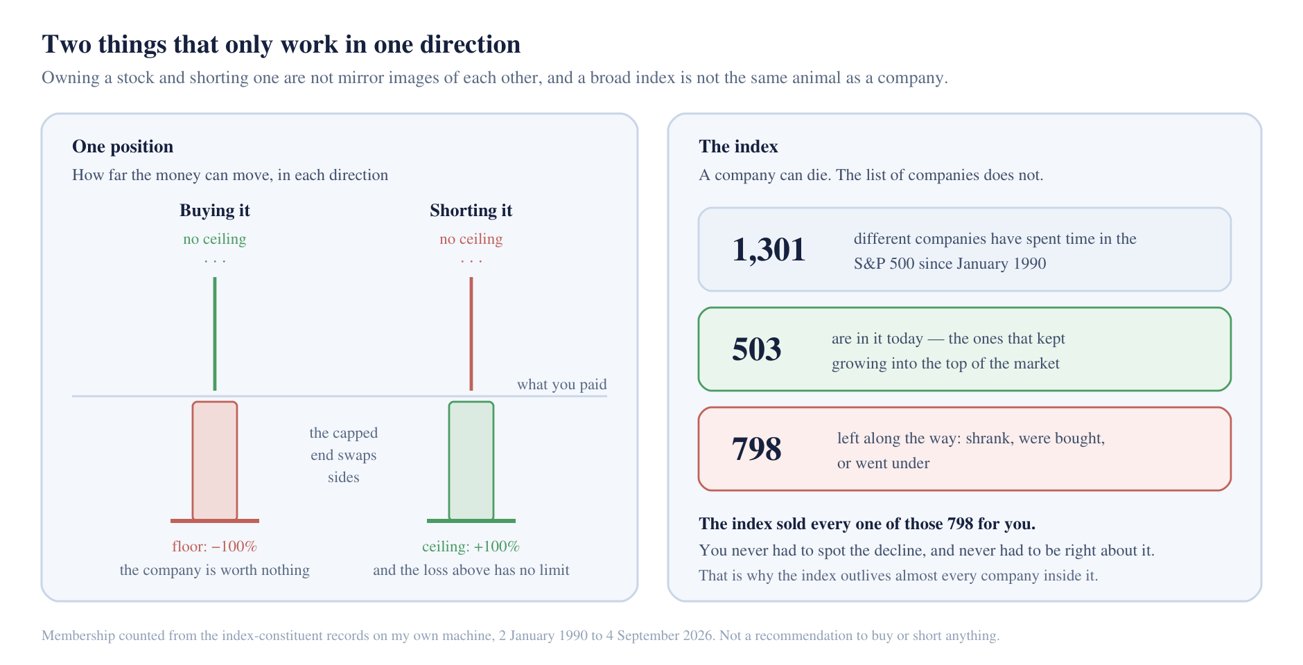
That is the mechanism, and it does by rulebook what a stock picker has to do by hand: it sold the decliners without anyone having to spot the decline, and it bought the growers without anyone having to be early. It is not instant, and the rulebook says so in as many words — the provider's own methodology document says it "believes turnover in index membership should be avoided when possible" and that "the eligibility criteria are for addition to an index, not for continued membership." A constituent that stumbles is not thrown out the next morning. But over the decades in my own records the sorting happened, and the index outlived almost every company that passed through it.
Two more mechanical contributors, both dated so nobody mistakes them for current figures: in the twelve months to September 2025, S&P 500 companies handed shareholders a record $664.9 billion in dividends and spent another $1.020 trillion buying their own shares back off the market. Buybacks shrink the number of shares the same earnings are divided among; dividends are cash out of the door to the holder. Both accrue to whoever is long. Both are a liability to whoever is short — a short seller has to hand the dividend to the person they borrowed from.
Why long rather than short
The two sides are not mirror images, and it is worth spelling out why.
The arithmetic is the obvious half, and it rests on one fact: a share price can fall no further than zero, but there is no number it cannot rise to.
Say you pay $100 for a share. The worst case is that the company ends up worth nothing and you lose the $100. That is the floor, and it is 100% of what you put in. The best case has no number on it — the share can go to $300, or $3,000.
Now short that same share instead. You borrow it, sell it for $100, and you owe one share back. The best case is that the company goes to zero: you buy the share back for nothing and keep the $100. That is 100%, and it is the ceiling, because the price cannot go below zero. The worst case has no number on it either — but this time it is on the losing side. If the share goes to $500 you still owe one share, so you buy it back for $500 and you are out $400. Four times what the trade could ever have made you.
The capped end and the open end swap places. When you buy, the cap sits on the loss. When you short, it sits on the gain. The SEC puts it plainly in its own investor bulletin: shorting "leaves an investor open to the possibility of unlimited losses, since a stock can theoretically keep rising indefinitely."
The mechanics are the less obvious half. To be short you must borrow the stock. D'Avolio's study of the actual US lending market — one large intermediary's book over 2000 and 2001 — found that 91% of borrowed stocks then cost under 1% a year to borrow, at an average fee of 17 basis points — 0.17% — weighted by how much stock was out on loan. Cheap. But the cheap ones are the ones nobody wants to short: he notes that S&P 500 constituents, supplied in bulk by index funds, were "almost always" in that cheap category. The 9% that were genuinely in demand averaged 4.3% a year, and a small tail reached 50%. In his data, the names most in demand to short were the ones that cost the most to borrow — and the owner could demand the stock back whenever he liked, which forces the short seller to buy it in the open market at whatever price it happens to be, on a day they did not choose.
The rules themselves hold back one side and not the other. Under the US Regulation SHO, once a stock has fallen 10% in a day, short sales in it are restricted for the rest of that day and the next. There is no equivalent restriction on buying.
And then there is the drift itself, working against the short position the whole time. Whatever the long-run number turns out to be, a long position collects it in the background and a short position pays it out, every year, before the trade has formed an opinion about anything.
Everywhere else, the measured base rate has been against the participant
The comparison that convinced me is not stocks versus a better strategy. It is stocks versus the other places you can point the same machinery — the same rules, the same software, the same discipline.
Day trading. The cleanest study I know comes from Brazil, where regulators handed researchers the complete account-by-account records for the country's most-traded retail instrument, a leveraged futures bet on Brazil's main stock index. Of 19,646 people who started day trading between 2013 and 2015, 1,551 persisted for more than 300 days. Of those, 97% lost money. Eight of them made more than the starting salary of a bank teller. Eight people, out of the nineteen and a half thousand who started. And the authors note that their figures exclude income tax, platform fees and courses, so they overstate how well day traders did.
Retail currency and CFD trading. (A CFD is a leveraged side-bet on a price, settled in cash — you never own the thing you are betting on.) Poland's financial regulator publishes the outcomes every year because the law obliges it to. In 2025, roughly seven active clients in every ten — 72.2% — lost money, and what the losers lost added up to nearly four times what the winners made. The regulator's own note says the 70–80% band has held for years.
Crypto. The Bank for International Settlements tracked retail crypto app users across 95 countries from 2015 to 2022 and found that in nearly all of them, a majority of investors probably lost money on bitcoin. The median user had put in about $900 and was down about $431 by December 2022. The section heading — "In stormy seas, the whales eat the krill" — describes their finding that large holders sold into the crashes while small ones bought.
Commodities. Erb and Harvey looked at 36 individual commodity futures over their December 1982 to May 2004 sample and found 18 with positive excess returns and 18 negative, an average of −0.51%, and an average t-statistic of 0.04. That is the statistical signature of nothing. A later study by Bhardwaj, Gorton and Rouwenhorst re-checked the case on the ten years after the original work — out of sample again — and these three are on the pro-commodity side of the argument; their abstract says their conclusions "largely hold up out-of-sample." Even so: commodities paid 3.67% a year over 2005 to 2014, with a t-statistic of 0.76, well inside what luck alone produces. Stocks over the same ten years paid 7.09%.
And trading stocks badly. Barber and Odean got the records of 66,465 households at a US discount broker for 1991 to 1996 and sorted them by how often they traded. Before costs, the busiest and the calmest picked stocks about equally well: every group's raw return landed between 18.5% and 18.7% a year. After costs, the busiest fifth earned 11.4% a year while the market returned 17.9% — and the paper's own like-for-like comparison is that the heavy traders gave up 6.8% a year against the light traders in the same sample. Same market, same instruments, same direction. The difference went to the broker, in commissions and in the spread.
The case against me
This is where an article like this normally stops. It should not.
Most individual stocks are losers. Bessembinder's work is the hardest fact in this piece. Across all US common stocks from 1926 to 2016 — 25,332 companies — only 42.6% had a lifetime return that beat one-month Treasury bills. Fewer than half, 49.5%, made any money at all. The median stock lost 2.29% over its whole listed life, the single most common outcome was losing essentially everything, and the entire net wealth creation of the US stock market over those 90 years, $34.8 trillion, is attributable to the best-performing 4% — about a thousand companies. The other twenty-four thousand, collectively, matched Treasury bills. His global follow-up found the same thing outside America: from 1990 to 2020, 55.2% of US stocks and 57.4% of non-US stocks did worse than those same Treasury bills. The drift belonged to the basket, not to any name inside it. Concentration is where that base rate stopped applying.
The long-run record may be a quirk of one century. Edward McQuarrie rebuilt US stock and bond returns back to 1792 and concluded, in the Financial Analysts Journal: "sometimes stocks outperformed bonds, sometimes bonds outperformed stocks and sometimes they performed about the same... sometimes there is an equity premium, sometimes not." The equity premium is the extra return shares paid over bonds. In his figures, stocks beat bonds by −0.29% a year across the nineteenth century and by +6.54% across the twentieth. Over the whole two-century record he puts it at 3 to 4 percentage points a year — roughly half what the twentieth century alone suggests. Jeremy Siegel disputes his early bond data. I am not qualified to referee that. What it does mean is that "stocks always win over long horizons" is a claim about one century, stated as a law.
The waits are longer than anyone plans for. How long it took the US market to regain a previous peak depends entirely on what you count:
| after the September 1929 peak, recovery took | |
|---|---|
| index price, not adjusted for inflation (my data) | 25 years |
| index price, adjusted for inflation | 29 years |
| with dividends reinvested and inflation removed | 7 years |
The 2000 peak works out at 13, 14 and 13 years on the same three measures — the inflation-adjusted series dates that peak to August rather than March. So dividends transform the 1929 episode and barely touch the 2000 one, and even the friendliest reading of 2000 is most of a decade. Meanwhile Japan's Nikkei set its record close of 38,915.87 in December 1989 and did not exceed it until February 2024, 34 years later, with a low of 7,054.98 along the way. That is a developed market, not a frontier one.
Momentum specifically decays after publication. McLean and Pontiff took 97 market patterns academics had published and checked what each one did afterwards. On average a pattern paid 26% less on data its discoverer never saw, and 58% less once the paper was in print — and they read the gap between those two figures, not the whole decline, as investors reading the paper and piling in. Publishing an edge is one way of spending it. Hou, Xue and Zhang then re-ran 452 published market patterns and could not reproduce 294 of them. Momentum was not among the casualties — their verdict was "price momentum fares well in our replication," at 0.82% a month over 1967 to 2016 on their main construction; when they copy Jegadeesh and Titman's own procedure instead, where every stock counts the same, the figure runs 1.18% a month in the original sample and 0.7% in the extended one. My own large-cap measurement sits at the weak end of that range.
And the crash risk is not theoretical. That 7.5%-a-year long-only figure from Daniel and Moskowitz comes with a bill, and their paper is where it is itemised. The two worst months for the winners-minus-losers trade in 87 years were consecutive: July and August 1932, when the losers rose 232% and the winners rose 32%. Between March and May 2009 the losers rose 163% while the winners managed 8%. That is what showed up in my own data as the four quarters ending December 2009. The trade does not decay gently when it turns. It hands back years in weeks.
So this is the one I picked
Put it all together and the honest summary is this. Momentum is real, widely replicated, and smaller and less reliable than its reputation — in the large caps I can actually trade, over the last seventeen years, it added approximately nothing. The upward drift of a diversified basket is larger, older and better documented than the ranking effect on top of it, and it is also not guaranteed, not constant, and capable of making you wait a decade. Individual stocks were mostly losers in that record; the index was the thing that drifted.
I still choose this over the alternatives, for one reason. In every other market I have looked at, the strategy has to produce the entire return by itself. Commodity futures showed no measurable long-run premium. Currencies have none by construction — one side's gain is the other's loss, minus the spread. Shorting starts with the drift against it, the borrow bill against it, and a rulebook that holds it back and not the other side. In retail FX, day trading and crypto, every set of figures I have found — a regulator's, a central bank's, a university's — has put the median participant at a loss.
Long equities is the only one where the base rate I start from has historically been positive. Across that record, a mediocre system still had something behind it, and a good one had something to add to. That is not an edge. It is a decision about where to stand while I look for one.
None of the above is advice, and none of it is a forecast. Every figure here describes something that already happened, over the period stated, and periods end.
Everything else on this site is me trying to add a little to that base rate, and saying in public how often I fail to.
Sources
Checked in September 2026.
Momentum
- Jegadeesh, N. and Titman, S. (1993). "Returns to Buying Winners and Selling Losers: Implications for Stock Market Efficiency." Journal of Finance 48(1), 65–91. PDF
- Jegadeesh, N. and Titman, S. (2001). "Profitability of Momentum Strategies: An Evaluation of Alternative Explanations." Journal of Finance 56(2), 699–720. The figures quoted here are from the freely available NBER working paper 7159, whose out-of-sample window is 1990–1997. NBER
- Rouwenhorst, K. G. (1998). "International Momentum Strategies." Journal of Finance 53(1), 267–284. Free Yale working-paper version
- Fama, E. F. and French, K. R. (2012). "Size, value, and momentum in international stock returns." Journal of Financial Economics 105(3), 457–472. PDF
- Asness, C. S., Moskowitz, T. J. and Pedersen, L. H. (2013). "Value and Momentum Everywhere." Journal of Finance 68(3), 929–985. PDF
- Geczy, C. and Samonov, M. "Two Centuries of Price-Return Momentum," published in the Financial Analysts Journal (2016). The pre-1927 figures quoted here appear in the earlier working paper, not the journal version. Working paper
- Daniel, K. and Moskowitz, T. J. (2016). "Momentum crashes." Journal of Financial Economics 122(2), 221–247. Open access. PDF
Decay, replication and costs
- McLean, R. D. and Pontiff, J. (2016). "Does Academic Research Destroy Stock Return Predictability?" Journal of Finance 71(1), 5–32. PDF
- Hou, K., Xue, C. and Zhang, L. (2020). "Replicating Anomalies." Review of Financial Studies 33(5), 2019–2133. PDF
- Novy-Marx, R. and Velikov, M. (2016). "A Taxonomy of Anomalies and Their Trading Costs." Review of Financial Studies 29(1), 104–147. NBER working paper 20721
Long-run equity returns
- Dimson, E., Marsh, P. and Staunton, M. UBS Global Investment Returns Yearbook 2026, public summary edition. PDF
- Bessembinder, H. (2018). "Do Stocks Outperform Treasury Bills?" Journal of Financial Economics 129(3), 440–457. DOI
- Bessembinder, H., Chen, T.-F., Choi, G. and Wei, K. C. J. (2023). "Long-Term Shareholder Returns: Evidence from 64,000 Global Stocks." Financial Analysts Journal 79(3). CFA Institute
- McQuarrie, E. F. "Stocks for the Long Run? Sometimes Yes, Sometimes No." Financial Analysts Journal 80(1), published online November 2023. CFA Institute
- McQuarrie, E. F. (2024). "Stocks for the Long Run? Setting the Record Straight." CFA Institute Enterprising Investor, 30 May 2024 — the source of the century-by-century figures. Article
- Shiller, R. J. Online data, US stock markets 1871–present (
ie_data.xls), used for the inflation-adjusted and dividend-reinvested recovery times. Shiller's monthly price is an average of daily closes, so the depth of the falls on his series differs from familiar daily-close figures. shillerdata.com - Nippon Communications Foundation (6 March 2024). "Nikkei Index Sets First Record High Since 1989." Article
The index and the ETF
- S&P Dow Jones Indices. S&P U.S. Indices Methodology; the passages quoted here are from the March 2025 edition. Provider's site
- S&P Dow Jones Indices press release, 4 September 2026: index changes effective 21 September 2026. Release
- State Street. SPDR S&P 500 ETF Trust (SPY) fund page; assets quoted as of 4 September 2026. Fund page
- S&P Dow Jones Indices, buyback and dividend release covering the twelve months to September 2025. Release
Shorting
- D'Avolio, G. (2002). "The market for borrowing stock." Journal of Financial Economics 66(2–3), 271–306. Summary
- US SEC, Office of Investor Education and Advocacy. "Investor Bulletin: An Introduction to Short Sales" (29 October 2015). investor.gov
- US SEC. "Key Points About Regulation SHO." sec.gov
The alternatives
- Chague, F., De-Losso, R. and Giovannetti, B. (2020). "Day Trading for a Living?" SSRN 3423101
- Polish Financial Supervision Authority (UKNF). Wyniki klientów na rynku Forex, results for 2025. PDF
- Cornelli, G., Doerr, S., Frost, J. and Gambacorta, L. (2023). "Crypto shocks and retail losses." BIS Bulletin No 69. PDF
- Erb, C. B. and Harvey, C. R. (2006). "The Strategic and Tactical Value of Commodity Futures." Financial Analysts Journal 62(2), 69–97. Working-paper version
- Bhardwaj, G., Gorton, G. and Rouwenhorst, K. G. (2015). "Facts and Fantasies about Commodity Futures Ten Years Later." NBER working paper 21243
- Barber, B. M. and Odean, T. (2000). "Trading Is Hazardous to Your Wealth." Journal of Finance 55(2), 773–806. PDF
My own figures
Everything described above as my own measurement was computed on my machine from daily price data and point-in-time index-membership records on 8 September 2026.
- S&P 500 index, January 1928 – 4 September 2026: 24,786 daily closes of the index itself, not of a fund. Price only, nominal. The holding-period figures use every possible start date, so the windows overlap.
- SPY, 29 January 1993 – 4 September 2026: dividends reinvested where stated, using the per-share dividend on its ex-date.
- Membership counts: index-constituent records from 2 January 1990 to 4 September 2026. These count listings, not companies.
- The momentum measurement: 425 monthly formations, January 1991 to May 2026, average 497 eligible companies per formation. Membership is point-in-time, so a company enters the sample only while it was genuinely in the index, and companies that later delisted stay in — 638 of the 1,301 price histories in the sample end before 2026. Ranking is the eleven-month return ending one month before formation; the holding period is the following three months; the ten groups are equally weighted. There are no commissions, no spread and no slippage in these numbers, and they measure an effect rather than backtest a tradeable strategy.